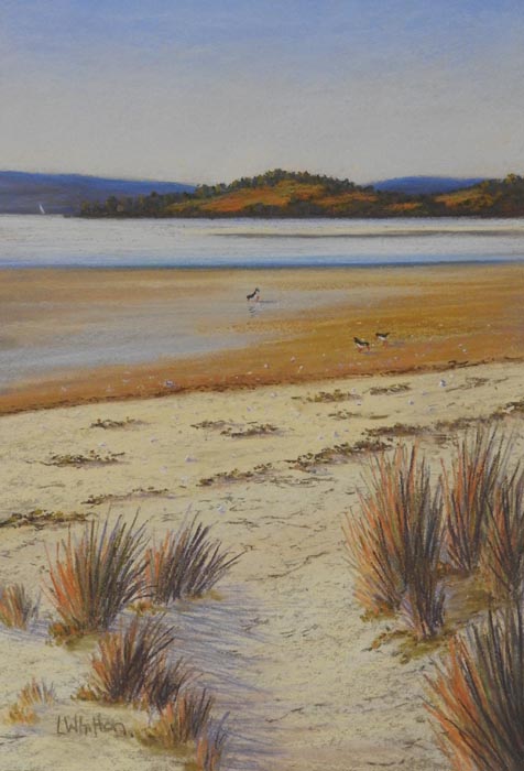
This is my very first post! I thought I would start with a demo painting of a local seascape to share my painting process with you. Hope you find it interesting…
Getting started.
Sometimes I’ll know just what I want to paint – other times I’ll look through old photos or my ideas board until something says “paint me”! Today I chose a photo of a local beach at low tide – I like the sense of distance and the diagonals in this photo. I know it will need something else to bring it alive but I have an idea for that.


Choosing the paper.
So I’ve decided which reference photo I’m going to use and now I need to choose the colour of my sanded paper. I use either Canson or Mi- Tientes sanded pastel paper because the tooth holds layers of pastel and I don’t need to fix the finished paper. ( more about fixative later!)
Anyway how to choose one colour from all the possibilities?
I take the photo and look for papers that either provide a strong contrast with the main colour or temperature of the subject or one that matches the dominant colour and temperature or maybe one that matches the temperature but is a darker or lighter tone than the dominant tone of the subject.
Here I’ve narrowed it down to 3 colours so I lay the photo over the intersection of the papers and see which one I think feels right.

I choose the mid tone colour as I think it will give a good under colour showing through the pale foreground sand , it takes care of the middle ground and won’t dominate the sky which I want to stay light and bright.
Now for the pastels!
This is when I get out my boxes of pastels and the fun starts. I’m going for my Great American ArtWorks seascape set, a fantastic set of Sennelier half sticks and my “orphans” box and a couple of pastel pencils to sketch it up.


Sketching up
I could transfer the image by any number of methods but I’m not too fussy about getting it exactly right and just sketch in the main forms of the mountains, hills, horizon, sea and sand The one thing I am careful about is getting the horizon dead level! I use a dark pencil for the background and then a light one for the sand and sea as I don’t want the dark to show through later layers.
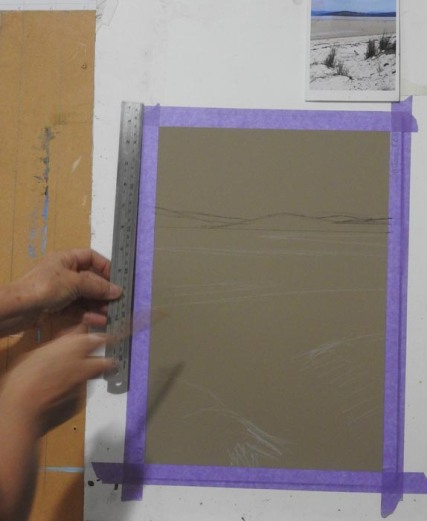
Rough sketch- but measure that horizon to get it level!
Blocking in
Now I start blocking in the main shapes loosely. Mostly I use the local colour ( the actual colour I see in the photo) but in the middle ground hill I pop in some bright reds and golds. I want these to show through a little under the final greens to give some added warmth to the painting. I make sure to put in some light pinks and yellows at the base of the sky for some sparkle. The wet sand gets a swathe of dark blue as it will be useful later in establishing the dips and shadows in the sand. Once I’ve finished blocking in smooth the sky and hills with the side of my finger to blend the colours.


The sky and hills
Next I work in some blues in the background hills and some greens in the middle hill. I add the suggestion of trees and some more golds into the dry paddocks. Also a little work on the junction between the wet and dry sand.

The sea and sand
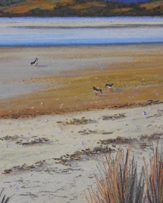
I add more layers of pale pinks, yellows and blues to the sky and some of the same colours in the sea. I start adding layers of creams, siennas, ochres and some purples to the wet sand and darken the edges of the sand bar . Now I add a sprinkle of washed up sea grasses to the edge of the wet sand.

Next it’s a bit of a suggestion of the path and then some seaweed on the dry sand.


I work up the grasses around the path using darks and then some lighter colours for the sunlit side. I use some hard conte sticks for the grasses. Notice I’ve darkened the water’s edge some more and added a little pink to the water as well. I want to give a sense of how shallow it is here. Some shadows from the grasses help to show the slope of the path.


Finishing touches
I want to add a little life and movement so I pop in a few wading birds on the wet sand. They also help carry the eye from the strong sand diagonals back towards the water and hills. You can see I’ve also strewn a few white shells and some darker marks around for a bit of added interest and texture to the sand.
All done!
A final distant sail boat , my signature and the painting is finished. On the whole I’m quite pleased. The finished painting retains the strong compositional lines that first drew me to the subject but I’ve warmed it up, strengthened the contrasts and added some movement.


Leave a comment