Acrylic inks – dare to be brave!

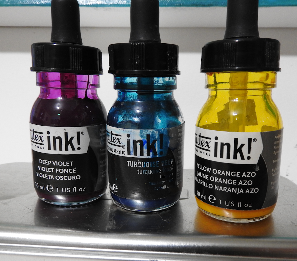
Sometimes I need a bit of a kick in the pants to shake me up and get me a bit braver when it comes to using colour. When I think I’m getting a bit too safe I like to break out the acrylic inks and use them as an underpainting.

acrylic-ink-underpainting

I’ve been pretty liberal in the cliffs with deep violet, turquoise blue and a dollop of yellow orange as well.I just lay it on with a soft brush and let it run and bend. Sometimes I just pour it straight onto the paper or canvas or add colour with the droppers.

inks

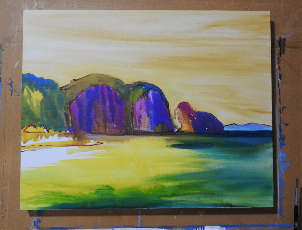
I’ve used a lemon yellow in the water and mixed it with the turquoise to make a strong yellow, green underpainting. I give the sky a yellow ochre wash and I’m all set to be a bit braver when I start adding the acrylic paint.

acrylic-overpainting

Here I am part way through. I’m liking the cliffs although The Writer thinks the purple is  a bit strange. I often ask for a critique from various family members walking past ( and yes they do sometimes try and avoid eye contact!) I’ve found the best critic is The IT Geek who has an uncanny knack of homing in on the bit I’ve been secretly worried about whereas The Writer often homes in on the bit I’m quite pleased with.

I’ve still got a lot of work to do but I like where it’s heading . I ‘m trying for really sunlit cliffs and I think I’ve got that on the island. Sometimes it’s the small areas that draw the eye and I like the gap between the headland and the island. The beach area and it’s trees have a lot of work to do yet as well as the water needing some more glazes.  We’ll see what happens tomorrow!

Responses

  1. Osyth Avatar

    I like the purple. Once you added the yellow the oddness evaporated for me and I’m left with a lovely easy relaxed sense as I stare

    Like

    1. lindywhitton Avatar

      Yes – it’s the combo of yellow and purple that makes it work.

      Liked by 1 person

  2. laura lecce Avatar

    Absolutely lovely! But I’m a bit of a biased color fanatic 🙂

    Like

    1. lindywhitton Avatar

      Colour me bright is what I say!

      Like

  3. Claudette Avatar

    Loving it – especially the cliffs.

    Like

    1. lindywhitton Avatar

      The cliffs were fun- The trees not so much – actually you haven’t seen the trees . Will have to go post the completed painting now.

      Liked by 1 person

  4. Brian Lageose Avatar

    I think the purple is wonderful…

    Like

  5. lindywhitton Avatar

    Thanks for your vote of confidence Brian – I can now tell The Writer it’s 5 to 1 in favour!

    Liked by 1 person

  6. skybright1 Avatar

    It was the island cliff that caught my eye as soon as I looked at the second painting, looks just like the sunshine is hitting it!

    Like

  7. Sabiscuit Avatar

    This painting reminds me of my secret hideout. I love the sharp lines on the cliff. I could almost walk into the painting.

    Like

  8. Loretta Avatar

    That painting fab Lindy u are soooo talented. I wud lov more blue or torquise in the sea only a personal viw. I cant wait to get home from work ts try these thsnks . Loretta

    Like

    1. lindywhitton Avatar

      Thanks Loretta. Happy painting!

      Like

Leave a comment