I’m always looking at ways to teach my pastel class the value of observation . This term I decided to focus on ordinary objects for the first half to reinforce that any subject can be interesting if we focus and observe.
We’ve painted translucent objects, shiney objects and reflective objects…without painting any of those objects at all. “What the heck is she talking about?” I hear you ask.
Well…we looked for simple shapes and their coresponding values and we painted those shapes and values and as we did that the objects simply became apparant.
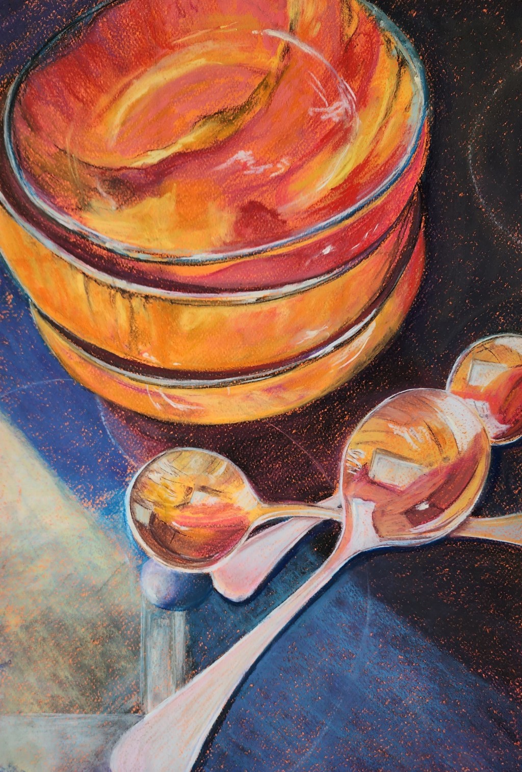
I’m not a big still life artist…nature is my thing…but I have to say I really enjoyed my foray into the ordinary, everyday objects all around us. Here’s a step by step demo I did for my class of my favourite red bowls waiting besides the soup spoons for lunch to be ready.
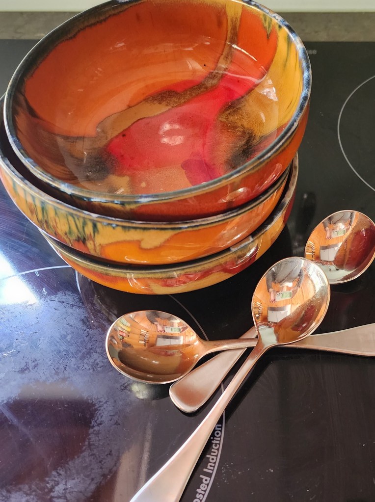
First I set up my bowls in a stack on the black cooktop because I liked the contrast of the red against the black.
We talked in class about ways we could make our ordinary objects into an interesting composition and I suggested a few simple ideas:
- experiment with different formats
- add a human element eg. a hand
- exaggerate colour
- use reflective surfaces
- add contrasting backdrops
- make a grouping
- tell a story
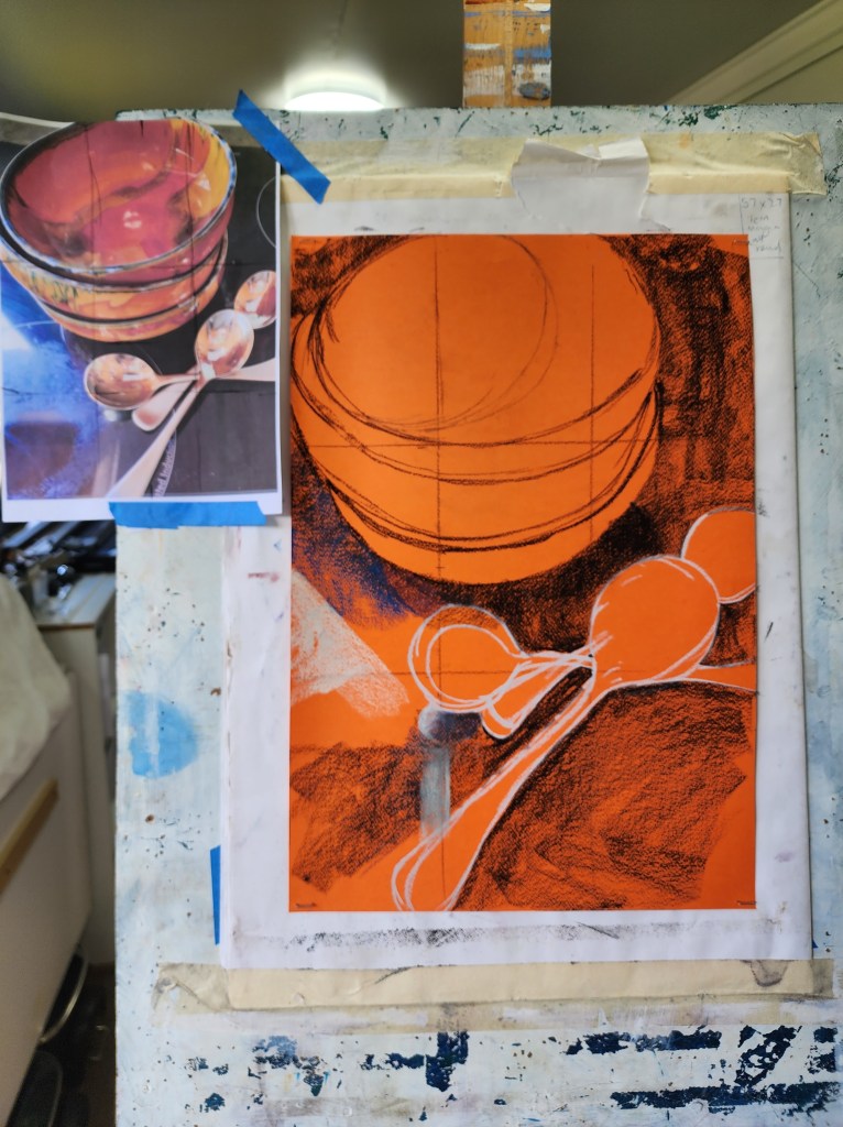
I decided on orange for the background colour to pick up the main colour of the bowls.
I drew in some third gridlines to help me sketch it out in the correct preportions.
Next I sketched in the main outlines using a dark pastel (hard Nupastel).
I blocked in the large areas of dark background using the side of the pastel.
Then came a few hints of light edges with an almost white Nupastel stick to get the shapes of the spoons – the black would have been too hard to cover later.

Now I started to model some of the rounded shapes using red and ochre hard pastel sticks on their side.
A gentle swipe of a light yellow added in some reflected light on the cooktop.
The reflection of the spoon is suggested with a light blue and a darker purple/mauve.
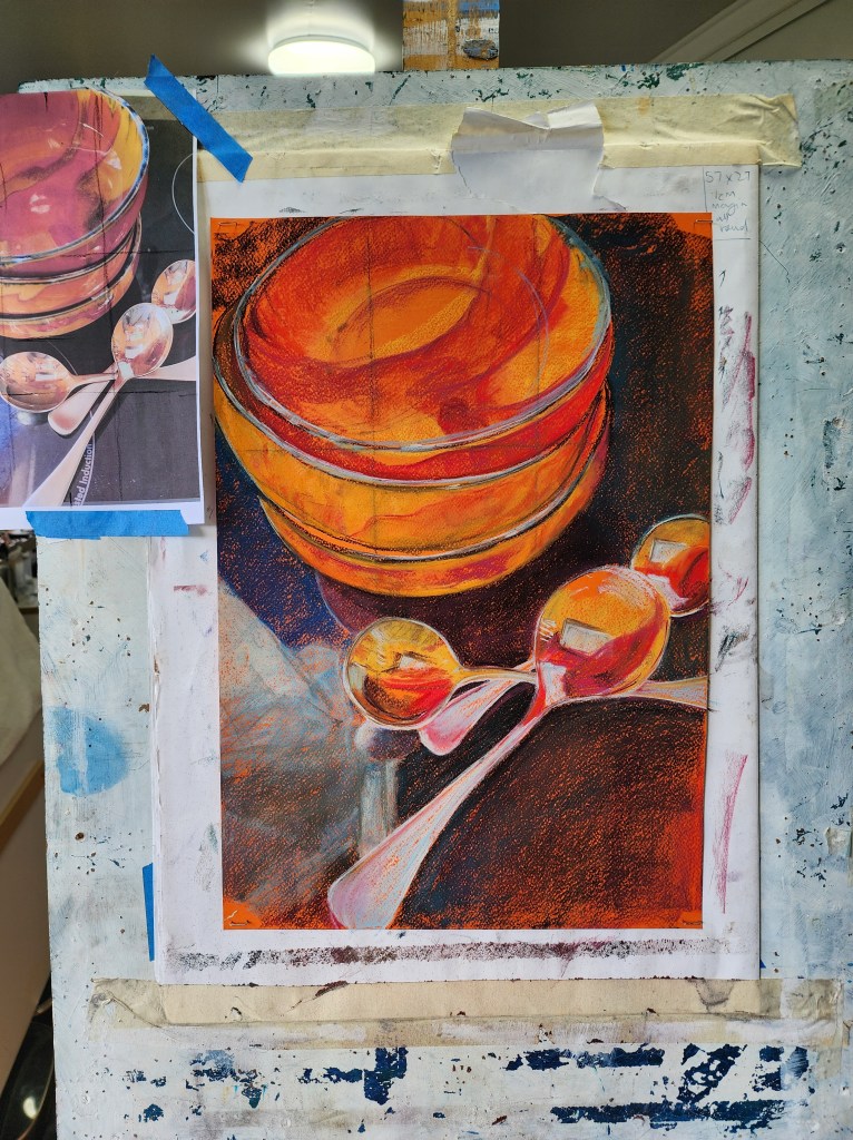
I keep refining the shape of the bowls using hard pastels on the lip to create light and dark areas. Light blue and almost black Nupastels.
The spoons get blocks of lights and darks added to create the reflections but I don’t get too worried about copying exactly
I use some light warms and cools to shape and shade the spoon handles.
I scrub a little dark green over the black in the top right and some dark reds to create the reflection of the bowl

The shadowed spaces between the bowls are strengthened with dark reds and browns.
Dark edge lines are added to some of the coloured blocks in the top bowl which help to define the rounded shape of the bowl
I keep working the background with some more light layers of darks
I add in two light coloured circles on the cooktop just because I like the way they mirror the shape of the spoons and bowls
Notice the first shiny highlights in the top bowl – they follow and help to define the shape.
•Still only using HARD pastels

I add a few more glazing layers of lights and darks to the cooktop using some Terry Lugwig soft pastels and cut back into the edges of the spoons to clean them up.
I look for any misshapen areas on the bowl and spoon lipsand ask myself “are the curves looking like curves?”
Then I add afew extra darks into the spoon reflections and some shadowed areas around the handles and where they cross each other.
A few more questions:
•Are the values correct?
•Is there anything that looks off?
Now I’ll leave it for a day and recheck with fresh eyes tomorrow.
It’s hard not to enjoy playing with all thet colour and those delicious curves! It was fun to work on such a vivid background and just stick to my hard Prismacolours until right at the end. Maybe I will do some more still life paintings afterall. What about you? Is still life your thing or are you into abstract, which is where I’ll be taking my class next week.

Leave a comment