
Postcard No 51: Life by the River
The last few days I’ve been a bit unwell so I’ve spent plenty of time on the couch looking out over the grey river and sky. It got me thinking about how many variations there are in greys when we look carefully..

Here there are violet greys, blue greys, and green greys all working together in harmony .
You can also see some of the mid tone paper showing through here and there adding some warmth to the postcard.
The scribbles of white and black in the foreground give a bit of energy and suggest the riverside branches.
The birds add some movement.
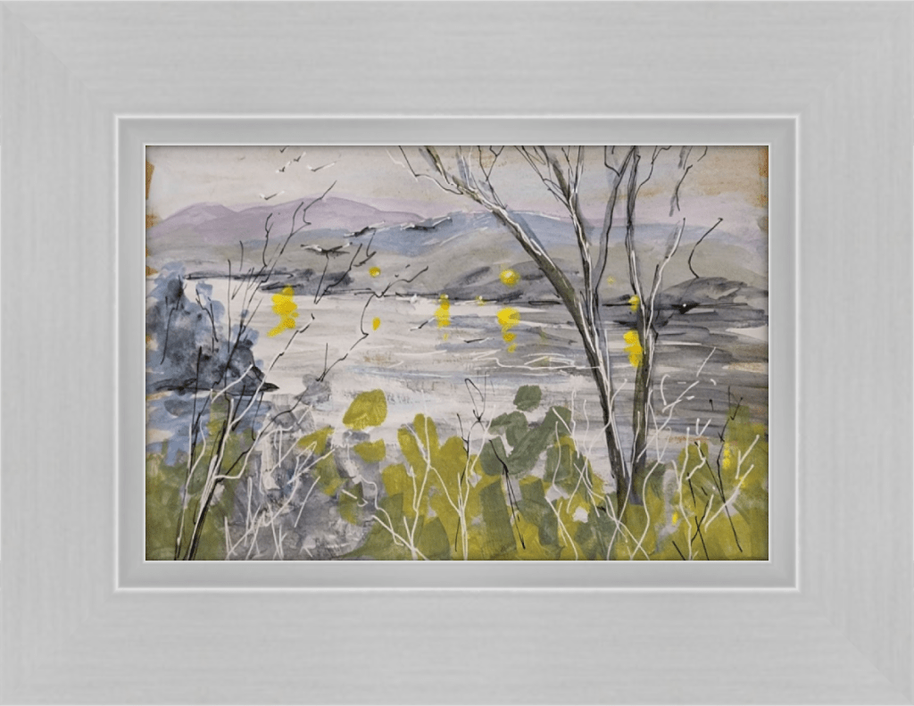
It’s an interesting fact that the percieved “value” of art can be varied depending on how it’s presented to the viewer.
So I thought…how would it look framed and how would different frames change the percieved value of this little postcard painting?


This simple frame complements the greys and the narrow white borders seperate the sketch visually from the frame. It works nicely. Add a wide double mat and suddenly the postcard gains greater importance and value.


The green frame overwhelms the delicate sketch.
With the addition of a double mat it now enhances the painting by picking up on the greens and green greys, whilst allowing a restful area around the sketch.

Compare the colours. Which works best?
Choosing a wide frame can act like a mat by creating space around the sketch and making a “larger” painting. The colour choice is all important because it can change the mood of the art. Here the grey frame makes for a quiet, introspective piece whilst the cream picks up on the brighter, warmer notes.
There are lots of ways to play with framing to enhance the appeal of your artwork. I often use an online frame shop to upload my art and test out frame options. For this little postcard I used Frameshop.
Out of interest …which framing option do you think looks best?

Leave a comment