
Life by the River
Yesterday was my weekly pastel class and I set everyone a small exercise to get them thinking more critically about what their “style” is.
I encourage the class to resist copying other artist’s but we look at many different artists’ work over the course of a year and discuss their techniques and how they achieve their particular style.
This helps us see the many possibilities with pastels and gets us thinking about different directions we might like to try.
The little exercise involved me first setting out 5 groups of 4 photos. I invited the class to comment on each group and offer suggestions about how they related to my own style of painting. They easily identified the common thread in each group.
Then I took a photo from group 1 and add it to group 2 and asked did it fit in this group and why? This was a bit more difficult but they made the connection and were able to see that there were several common threads to my style that were apparent in each of the seemingly different groups.
Now it was their turn. I had asked them to bring four photos of any subject to class. The only criteria was that they had to really like the photo and want to paint it.
They then had to write down a few words for each photo that described why it appealed to them so much. I explained this would help them see some of the common threads that were the underpinning of their own developing style.
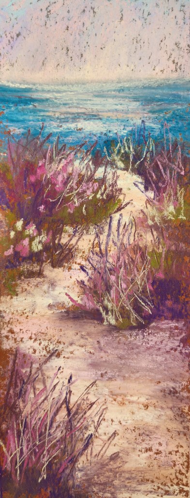
What’s all this got to do with today’s postcard? One of my students was very surprised to find that her preferred palette is pink and green and that most of her subjects had a tutu shape in them ( her daughter is a ballerina).
Pink and green is not a colour combination I usually gravitate to so today I decided to pay homage to Kristen’s palette and do a quick , no reference, intuitaive postcard of evening over a sandy beach path down Dover way.

Leave a comment