Sometimes I finish a painting and think…”I should have stopped a few stages ago”. I’m sure that happens to most artists so I know I’m not on my own here. That’s why I often recommend to my students to take a photo if they’re happy with how their painting’s going , because later on they can look back and say to themselves, “I should have stopped here!”
I’ve recently come back from 5 weeks in the UK, a lot of that was spent in the glorious Hebrides. I did a bit of field sketching but it’s often hard to find the time when you’re travelling with someone else so I usually take lots of photos and then get into the studio as soon as I’m home. A bout of flu has kept me idle for a few weeks but I’m finally well enough to get to work.
We spent one very damp and overcast day driving around the spectacular Mull coast and there was one place that captivated both me and my husband. We pulled up at the loch edge and there were three derelect boats leaning crazily together on the shore amidst the rocks and seaweed. The paint was peeling and they were full of character. Out came our cameras and we spent quite a bit of time taking photos and simply enjoying the atmosphere. I knew it would be one of my first studio paintings once I was home.

I planned to paint this one in pastels as I felt it would allow me to capture the atmosphere bes.
I was topping up between a warm brown base and a cooler mauve/grey. I did a couple of mini studies on the two coloured papers using the same pastels and decided I prefered the quieter version on the mauve paper.
It only takes me a few minutes to do these studies and I find them useful to work out values, composition and colour palette so it’s a very good investment before I dive into a large painting.
I started with an acrylic ink underpainting on Colourfix pastel paper..
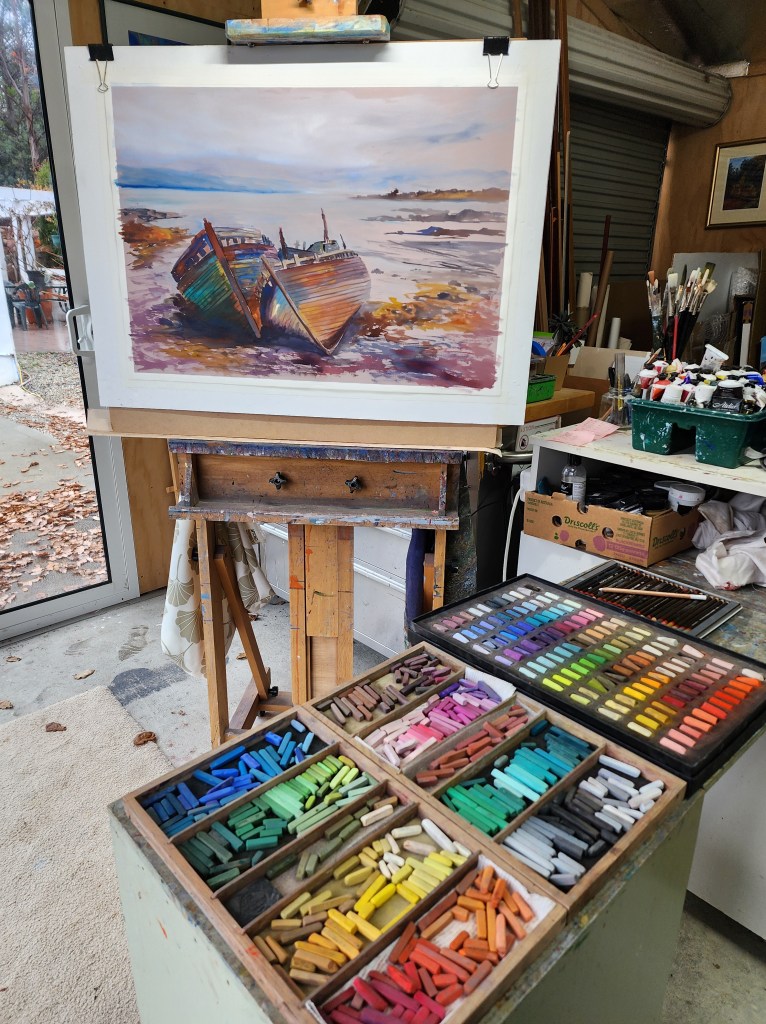
I started with an acrylic ink underpainting on the Colourfix pastel paper. I love how easy it is to get the bones of the subject down in ink. In this case I wanted to get a really well drawn image of the baots and capture the colourful peeeling paint.
The ink goes on quickly and loosely, I let the colours do a bit of mingling on the paper and once the base is set I can go in with the pastels.
This underpainting was a joy to paint and it transported me right back to the loch side. I was very happy with the vibrant colours on the boats and yet I still felt I’d managed to keep the essence of an overcast day.
I liked the underpainting so much I was tempted to just let it be. I left it on the easel for a couple of days before I got up enough courage to start in with the pastels.
I was afraid I would ruin the freshness and sense of atmosphere….
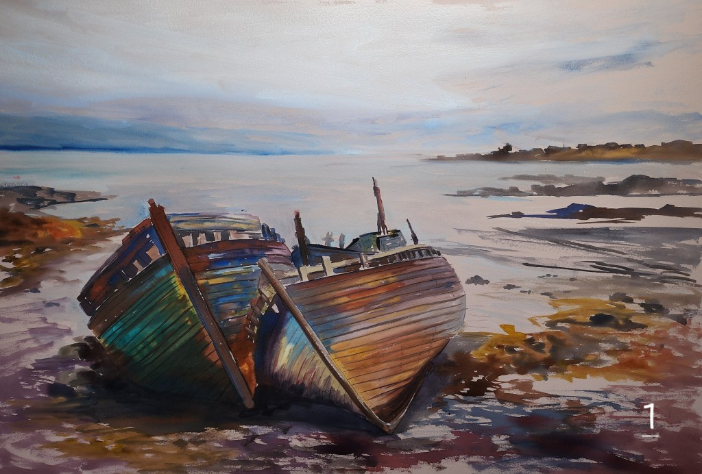
Here’s the original ink painting. I used Amsterdam and Art Spectrum acrylic inks.
It was tempting to leave it as a stand alone painting but I knew I wanted a bit more texture on the shore.

I started in slowly with some swipes of light colours in the sky to get me started.
A little bit of blue on the distant hills as well and then some of the sky colour into the water.
A swipe of ochre over the seaweed area to add a bit more texture.
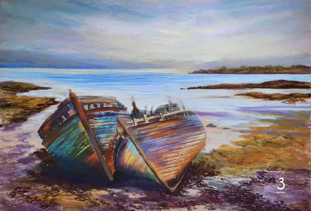
Next I added some deeper blues to the water, blended the sky and started applying some foreground seaweed base colours.
The boats got some more pastel working over and into the vibrant ink colours to neutralise a little in places.
The far headland has a dusting of pastel to indicate some foliage.
Working some darks in the very foreground.

Starting to add some more details on the boats with a dark pastel.
The seaweed is getting a few scribbles of green and sienna to build it up.
Blending the smoother water around the boats as it comes into the shallow sandy area.
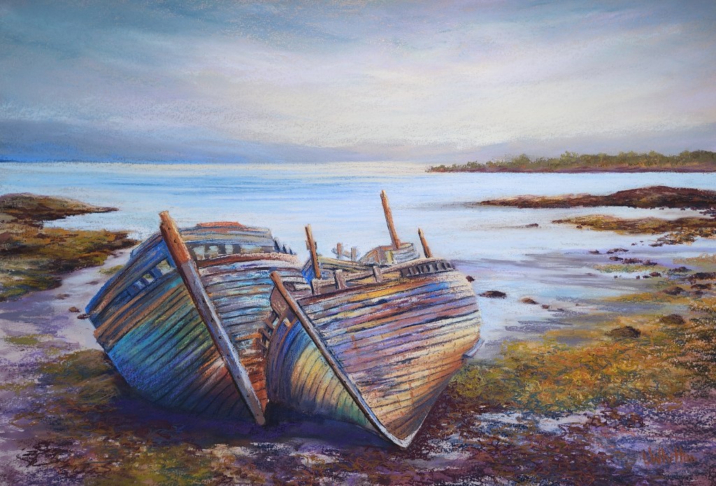
A few last details on the boats and it’s all finished.
I think there’s a good balance of textured areas and restful, quieter areas.
I like the glow in the sky that warms up the background a little.
I had originally meant to have the boats positioned a little higher as in the initial sketches but miscalculaed when I drew it up and then decided to keep going.
Perhaps that was a mistake.
I’m sure there are areas I could have left more undone but overall I feel each addition helped the painting along. I was worried I would be saying , ” I should have stopped at the ink stage” but I’m glad I went ahead with the pastel because I feel it’s a more complex and nuanced image now. I’d be interested in your thoughts. Should I have stopped sooner?

Leave a comment