
Life by the River
Today the sun came out and I noticed how it made the grassy bank pop with a bright winter yellow green. Even though the old jetty posts looks like the obvious subject in today’s postcard it wasn’t really what attracted me to this scene. Sometimes it’s not the obvious that’s most appealing and I always find it interesting talking to fellow artists about what inspired them to paint something.

The jetty posts do help the composition by the diagonals they make pointing us to the grassy outcrop and the far shore but it’s not the foreground that holds all the interest for me.
I left the far bank and the grassy outcrop pretty loose but I did use a good variety of different greens to keep it interesting …some cooler blue greens and then the warm, sunny, yellow greens with some olive greens thrown in as well.
When I finished I felt the posts were a bit wishy washy so I added in some fineliner and I think that’s made for a stronger sketch all round. I could have just added in some darker paint but I wanted the contrast of the sharp, linear marks against the soft background and I since I’m restricting myself to one small flat brush for all these postcards I couldn’t get that very fine line I was after with the brush.
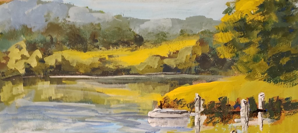
I feel this crop works as a stand alone postcard. The added posts and small boat make a nice contrast although they’re a little too close to the lower edge.
If I added in a little more water I think I would be work quite well as a composition.
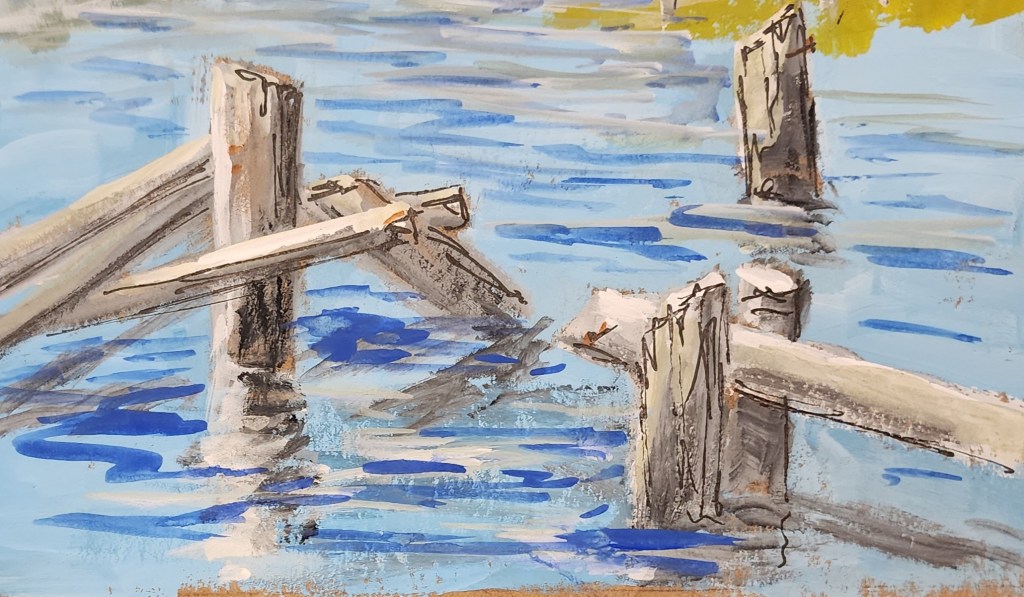
On the other hand, the posts aren’t interesting enough on their own to make a successful picture.
They’re positioned fairly well in the picture format but there isn’t much contrast in terms of value and colour so my eye is in and out pretty fast.

When I combine the two halves of the postcard you can see how all the leading lines encourage the eye to roam around the painting. I have more to say about creating visual pathways here.
There are several areas where the eye gets to bounce around in little triangles keeping you exploring the picture for longer and then there’s all that water which is fairly flat so we get a bit of a rest .
Maybe it’s a picture of two halves though? I’m still on the fence with this one.
If I were to upsize this postcard do you think I should get rid of the foreground posts and concentrate on the rest of the painting or leave it as it is?

Leave a comment