Pastel v Gouache: Postacrd No 85

Life by the River

While I’m in the pastel groove I thought it would be fun to repeat Postcard No 82 and see how the pastel version compares to the original acylic gouache postcard.

Postcard No 86: A Silver Sliver. Life by the River Soft Pastels on Colourfix paper.
Postcard No 82: A Sliver of Silver . Life by the River. Acrylic gouache on sketchbook paper.

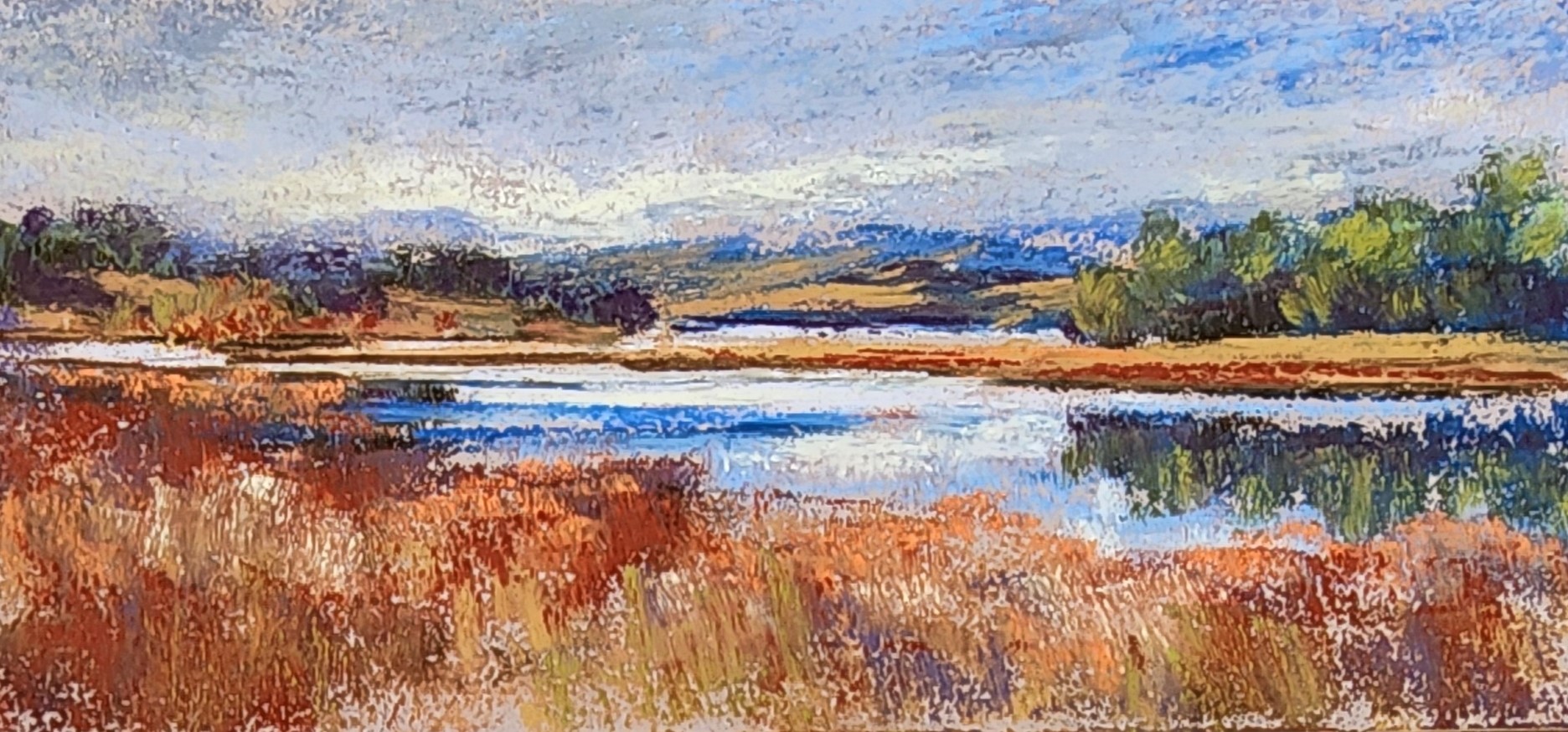
They both capture the scene fairly accurately as I remember it. The palettes are a little different with more saturated colours in the pastel version. The pastel has more energy and the gouache is more tranquil. When I scale up this one it will be the pastel version.

Do you have a favourite ?

Responses

  1. skybright1 Avatar

    A favourite, yes and no, because I like bits in each one best! In the pastel.I like the foregroubd and left side hills best. In the acrylic I like the water, centre hils and sky best. Picking and choosing isn’t.very mannerly though!

    Like

    1. lindywhitton Avatar

      I think picking and choosing is fine. I do like the acrylic sky best as well.

      Like

Leave a reply to skybright1 Cancel reply